My Website:

My Website:
Click to access my website

My Music Video

Monday 18 December 2017

News Practical Task


1. Explain your role/responsibility within the team and the task. What were you required to do?
Harvey and I were in charge of creating The Telegraph's social media pages within our team, with Dara, Derek and Zain working on The Telegraph Online and Morgan and Andreas creating The Daily Telegraph newspaper. I was in charge of the whole Twitter page, where I chose the story, an image, a post and a Twitter headline, and Harvey and I both contributed towards the Facebook page, where I was delegated to choose the image for the story and the page's cover photo.

2. For one media form, describe the codes and conventions you chose to follow and explain their intended impact.
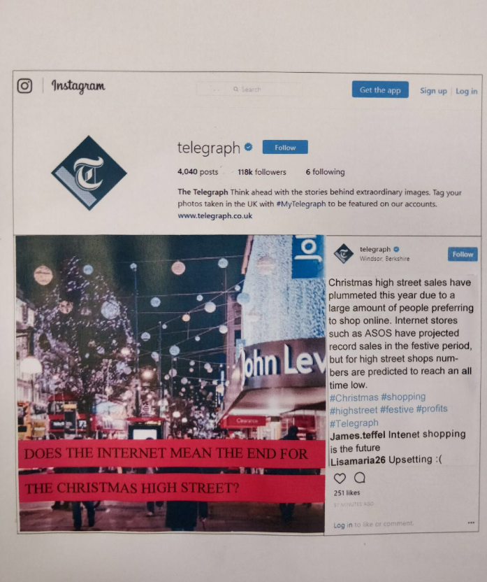
For the Twitter, I began by choosing the story about the Brexit deal being agreed as this was going to be the main story for The Telegraph Online and so by promoting it on the Twitter, it would be more likely to get more hits overall. I also chose MCU two-shot of Theresa May shaking hands with the President of the European Commission, Jean-Claude Juncker, both with big smiles and the UK and EU flags behind them to create a celebratory tone for the post. A very similar picture of the two politicians was also chosen for the Facebook page with a more concise wording of the same story for the post, "Britain is out of the EU after a deal is agreed." This is a convention of The Telegraph's Facebook page and would allow the audience to recognise the same story but perhaps understand it better in the clearer wording. For the Instagram page, Harvey chose a picture of Oxford Street and overlayed it with bars of pink with "Does the internet mean the end for the Christmas high street?" in a black font. This follows conventions of The Telegraph being focused on London and putting a caption over the photo, which they often do on Instagram. As well as this, a professional picture was chosen which would appeal to the target audience, who would open Instagram to look at pretty pictures.

3. Explain how your choices reflect the real newspaper's values and target audience.
Our choice to make the Facebook page's cover photo a picture of the Union Jack flag with the Big Ben and Houses of Parliament in the background reflected the London-centric perspective of The Telegraph's audience. As well as this, we wrote our headlines to signify Theresa May as a good leader and chose the headline "Theresa May feels ‘a weight removed off her shoulders’ after Brexit deal agreed in historic divorce talks in Brussels" as the Twitter headline to allow the audience to sympathise with Theresa May as they would support her government and party. We chose not to feature the Brexit story across all three social media platforms and instead created our Instagram headline around the story that 'Christmas High Street sales figures significantly down as shoppers choose the internet.' This is due to the younger age of Instagram's audience in comparison to the other social medias, and perhaps the fact that they would be slightly more interested with the festive event of Christmas shopping than the more continual talk of Brexit.

4. Explain how your team adapted the news across the three different media forms and the reasons behind your decisions.
We chose to not include the Trump headline about his 'Twitter troubles' on the website (although it featured as a secondary story on The Daily Telegraph's front page) as we believed that it would probably feature under a section of the website rather than on the front page. We also chose different pictures across all the platforms to make each unique, with one large scenic shot of the snow on the print version, two Brexit and one Christmas high street on the social media platforms and 5 smaller photographs for the online version, which is conventional to the style of that media form.

5. In hindsight, is there anything about your team's outcomes that you would adapt or improve?
In hindsight, our team would change the Facebook headline "Britain is officially no longer part of the EU" to something about the Brexit deal itself being agreed, which is what was featured on all the other forms (we realised this towards the end of our practical task and didn't have enough time to change it.) I may have also not had the bold textboxes on the Telegraph Online as they look slightly out-of-place and unlike the website. Other than that, I think our team prepared very well for the task and worked as well as we could, with the tight time restrictions, on the day of the practical task.


Sunday 3 December 2017

My Billboard Magazine Cover


1. Summarise the music celebrity you have created.  Include name, music genre, personality and how they are being used to comment on contemporary celebrity.

I created a rock-pop music celebrity called 'Jess Jones.' She is an artist that isn't scared of her feminine side despite her outer toughness and has power in the industry. I am using the character of 'Jess Jones' to comment that the young female contemporary celebrity can be powerful and tough without being afraid to show her feminine side.

2. Evaluate how you have constructed the representation of your celebrity through your cover image and cover headline/text (denotation/connotation of text and image).

I constructed the representation through my cover image through my choice of costume and make-up. I wore a pink frilly dress and large shiny silver necklace under my black leather jacket, I also had lots of make-up on with pink lipstick, mascara, eyeliner and powder. This choice of dress and make-up could connote Jess' feminine side as pink is associated with femininity whereas the black leather jacket worn over could connote Jess being tough on the outside to get through the tough music industry. She is also posing in a very relaxed way with a small smile and holding her leather jacket. This pose could suggest that she is very powerful and isn't scared of what is ahead for her music and celebrity status.
I chose the cover headline "Power Prodigy" as Jess looks very powerful in her pose and costume. The word "prodigy" also means 'a young person with exceptional qualities or abilities' and Jess' ability is not only in her music but staying true to herself and not wavering from that as her status changed from 'musician' to 'celebrity.' This is something that some other young musicians may struggle with so Jess acts as an outstanding example of how to do it.

3. Analyse how far you have used and/or challenged stereotypes of gender/race/age/sexuality in your cover.

I challenged stereotypes about gender and specifically women in my cover. Stereotypically, women are portrayed as being weak and without any control of their celebrity image (as their managers would control this.) I am challenging this by portraying Jess as a powerful woman, who controls her own image and acts tough to get through this. Despite this, she is not afraid of being feminine, something that stereotypically could be portrayed as a sense of weakness, and wears her pink dress with pride. I am also commenting on age as "prodigy" suggests that she is quite young. In the past, young female musicians have been seen as weak individuals who don't know what's best for them. However I am challenging this stereotype with Jess, who is very aware of her surroundings and the sometimes cut-throat strategies of those around her in the music industry.

4. Reflect on the production/editing process.  Are you pleased with the end result? Identify what is successful about your shot?  What would you have done differently in hindsight?

I took this picture, along with several others with different facial expressions, at our photoshoot before choosing this one and editing it on Photoshop. My editing was mainly to smooth out my hair and the spot healer tool before using it to put all the other elements of my cover in. I am pleased with the end result especially my initial choice of costume which has allowed me to stick with the pink colour for the masthead and her name in the editorial summary. I also think that the placement of the different elements is successful as it almost resembles a real billboard cover.
In hindsight, I would've picked a different font for the cover headline; I just don't think it fits with the rest of it. Although I wasn't sure about the blue shiny background initially, I am growing to like it as it represents the music industry and everything that Jess is being forced to come up against.

Friday 1 December 2017

Minecraft Pocket Edition Gameplay Video for YouTube


1. How you did it (for example, what videos did you look at, what technology did you use and how?)

I looked at DanTDM's YouTube videos for inspiration, especially his one playing Minecraft: Pocket Edition called 'Minecraft Pocket Edition | I Lost My World...' I liked his relaxed style and casual conversation that he would have that allows the audience to also be hooked on his bubbly personality as well as immersing them into the game play. I think it is very important for Minecraft YouTubers to have an interesting personality, as the viewers could otherwise just play Minecraft themselves.

I used two iPads, one to film myself with and another to "play" on, where I watched the clip that I was talking over. This allowed me to react to it in real-time and do it all in one-take, like the YouTubers would when they play the games. After recording it, I edited the two clips together on Filmmaker Pro where I inserted myself onto the other clip using the picture-in-picture setting before uploading it onto our YouTube channel.


2. How your video might attract the attention of Mojang and/or Microsoft, and how it might influence them.

My video may attract the attention of Mojang and Microsoft as, by playing Minecraft: Pocket Edition, I am essentially advertising the game for the company. As well as this, this video may attract their attention as it is child-friendly and doesn't feature any swearing or violent acts (that Microsoft would be against as they are aware of their young audience.) This video may also influence Microsoft due to my constructive criticism about a glitch which meant that I lost my progress on the game. After watching this video, they may become aware of this problem and try to resolve it to improve the playing experience for their fans.

Thursday 16 November 2017

Video Games & Me

Although I do not currently consider myself a "gamer," I used to play video games over multiple devices when I was younger. As well as playing on my portable DS and smartphone on longer car and plane journeys, I used to play in our living room with my family (normally the Wii) and with friends at their houses (often PlayStation or Xbox.) I also realised that I used to play video games to pass the time, whereas now I have replaced this with social media.


Minecraft Pocket Edition Mission

I had played Minecraft before this lesson on a PC which was very similar to the 'Pocket Edition' that I played on an iPad in the lesson. We had a mission to "build a dwelling that would protect you from the monsters." Although I had managed to build a house but I had lost sight of it when I explored the area, so I took a screenshot of the landscape instead. I think I should've also changed the difficulty level to "peaceful" as I kept getting distracted with aliens and zombies charging at me.

I think one of the main appeals of Minecraft is that it is played alone and lets the player reflect and relax with the gentle, earthy colour scheme of green, brown, grey and blue. I am also aware that the game is available on many different devices, including iPads, some smartphones, PCs and larger games consoles. Due to this I think that it could be played whenever the player wants, whether it be on-the-go or in their houses.


Thursday 9 November 2017

My Breakfast Show Segment

1. Did you fulfill all the content requirements; both in terms of including all the correct features and as well as the actual choices made.
Harvey and I included 10 second clips from both songs that we chose: Ciao Adios by Anne-Marie and Galway Girl by Ed Sheeran. Both songs are by British artists and mainstream tracks. We also played three jingles which we made ourselves by finding audio clips on YouTube and speaking over them as we played them into my phone where we recorded it. Our two news headlines were also topical and relevant to the whole of the Latymer community and we had a short promo for Mr Pashley. Our celebrity gamble segment was upbeat and included some audience interaction from both a phone-in guest and social media responses.

2. Have you nailed the conventions and style of Nick Grimshaw and the Radio 1 Breakfast Show?

There was some banter between Harvey's characters of Dave (the member of the public who called in) and himself as the news reader, which is conventional on the Radio 1 Breakfast Show. Like Grimshaw, I was very enthusiastic and loud and the general show was upbeat and reasonably fast-paced.

3. How well did you manage your running order and timings?

Despite only having one practise take and a very minimalistic script, we managed the running order and timings quite well. Harvey loaded our opening song 'Ciao Adios' and the drumroll sound effect on an iPad and 'Galway Girl' on his phone as I talked. All of the jingles were on my phone and we played them live, according to the running order which we passed between us. To cut down on time, we had a dodgy segment between the celebrity gamble with Dave and the news with Harvey.

Tuesday 7 November 2017

Current Music Video Analysis: Feels

Feels- Calvin Harris ft. Pharrell Williams, Katy Perry and Big Sean


1. Extreme contrast in camera shots/angles

Even though Pharrell Williams is featured in all three shots, there is great contrast between the MCU at eye level followed by the bird's eye view of his boat and finally a LS of him on his boat at eye level. After this, it cuts to a completely unrelated LS of a parrot in a tree. This contrast creates a slightly disorienting sequence but is conventional of the music video genre.
Related image

2. Combination of audio-visual

After the lyric "So I respect you, wanna take it slow," there is a very quick cutaway to a tortoise on the grass, taking a step. This illustration of the lyric is literal and therefore funny to the audience, as well as making the lyric be more prominent in the song overall.
Animated GIF


3. CU/beauty shots

There is a MCU beauty shot of Katy Perry's make-up followed by a MLS of her whole outfit. This introduces her and her bright aesthetic and happy tone to the audience, which reinforces the tone of the song.
Feels GIF

4. Direct address

Big Sean looks directly into the camera and therefore is talking directly to the audience. Although it would be unconventional to do so in Hollywood cinema, it is a convention of music videos to entice the audience and involve them in the video.
Animated GIF

5. Cutting to the beat

The shots cut to the beat throughout the song but attention is particularly drawn to it when the colour of the parrot changes to the beat. In between of shots of Big Sean and Katy Perry, the parrot (framed in a MS) changes from blue to red and disappears very quickly.
Animated GIF


Friday 6 October 2017

TV Drama Still Evaluation


My shot signifies my chosen TV drama sub-genre of horror through the mise-en-scene. The shot has low key lighting and the main source of light is coming from below the actor's face, therefore creating a larger, creepy shadow on the ceiling and surrounding walls. To achieve this effect, I placed the small light below the actor's face on a dim setting and minimised all other light by closing the curtain and switching the other lights off.

The conventional eerie setting of dark, narrow corridor also connotes the sub-genre and makes the audience feel claustrophobic and trapped. This is increased by the fact that the actor has their arms spread to the whole width of the corridor and is blocking the only exit. This connotes the dominant reading of this shot to be that the actor is the antagonist of the story and the narrative is centred on the theme of good vs evil. This shot portrays the antagonist finding the protagonist, who was hiding from him prior to this still.

I think that the technical code of framing is successful as it is a low-angle medium shot which makes the audience feel inferior to the antagonist but ensures that the antagonist's angry facial expression and eyes that scare directly into the camera can be seen.

In hindsight, I would try to centre the light directly below the actor's face so that the shadow formed directly above his head and on-centre. I would also try to place the actor's hands so that they are symmetrical and frame the shot centred.

However there is a juxtaposition of costume; the antagonist is wearing a jumper with a logo and jeans which are clothes that any normal teenager might, rather than a costume that connotes that he is the villain of the story.

Wednesday 20 September 2017

Film Trailer Analysis: Spider-Man: Homecoming

I will be analysing the film trailer for the Marvel film 'Spider-Man Homecoming' that was released on the 5th of July 2017 in the UK. Starring Tom Holland in the leading role, this film is the second Spider-man film reboot of the Marvel Cinematic Universe.


Audience Appeal
  • The primary target audience of fans of Marvel and action films may find the trailer appealing as it features Robert Downey Jr, who will probably be reprising his character of Iron Man
  • This primary audience may also find the trailer appealing as it has many action scenes with SPFX such as explosions and fires
  • In the opening scene, the four bank robbers are shown wearing Avengers masks. Although the real Avengers aren't present, this reference to other characters in the MCU makes the film funnier for Marvel fans and may encourage them to go to see the film if they enjoyed other films with those characters
  • The secondary target audience of teenagers may find this trailer appealing as it deals with issues that teenagers may deal with at secondary school.
  • For example, Peter doesn't concentrate in his lesson and the fact that he is playing a simulated Spider-Man game instead may suggest that he doesn't think school will be useful in his adult life, when he is hopefully in The Avengers and saving the world.
  • The school settings may also be familiar to this target audience

Genre Signifiers
  • The genre of action is signified through the action scenes in the bank where Spider-Man fights four robbers in a physical fight
  • It is further supported through all of the fire and explosions on the boat at the end of the trailer
  • The pace of the trailer increases in the second half of the trailer, creating a faster-paced action tone and demonstrating more shots of Peter in danger
  • Apart from action, the comedy genre is shown through Peter's interaction with the robbers, he leans against the wall, waiting for them to see him, and refers to the robbers with a casual "Sup guys."

Character & Representation
  • The main character of Peter/Spider-Man is presented as an awkward teenager, trying to figure out his way through both high school and saving the world
  • Despite the fact that Peter is presented as an inexperienced superhero, he is eager to improve to become an Avenger
  • Instead of concentrating in his lesson, Peter is presented playing a simulated Spider-Man game on his laptop, which may suggest that he finds school boring or irrelevant to him in adulthood
  • Liz is a character that is presented as a popular girl: putting up the large 'Homecoming' banner in the hallway and later walking past Peter with her friends following.
  • She is also potentially presented as Peter's love interest; he has his hand under his chin and is looking at her dreamily while discussing her outfit, as she walks past
  • Peter's best friend, who remains nameless in the trailer, is presented as his awkward sidekick who may not initially know about Peter's Spider-Man secret
  • Robert Downey Jr's character is connoted as being his emotionless guiding figure, who seems to be helping him in the voiceovers in the second half of the trailer
  • The dynamic between Holland and Downey's character seems to be one of Peter rebelling against Downey; he is heard saying "Stay close to the ground" while Spider-Man is shown towering up the Washington Monument
  • However, females do not have a central role in the trailer as Liz is the only named character in the trailer, another teenage girl and older woman are shown but not introduced or named
  • This may reinforce the representation of the 'damsel in distress' or love interest being saved by the superhero

Branding & Studio Identity
  • The Sony, Columbia Pictures and Marvel Studios video branding is shown near the beginning of the trailer, after the opening scene in the bank
  • The appearance of Robert Downey Jr in the trailer further supports the Marvel studio identity, as he has portrayed the role of Iron Man in past films in the MCU
  • The reference to the other characters from the MCU in the opening robbery scene creates Marvel's strong branding
  • #SpiderManHomecoming is featured on the end title screen with a link to the film's Facebook page, this may encourage fans to discuss the film on social media and raises the awareness of the Marvel branding

Tuesday 19 September 2017

Continuity Task Evaluation

This is the first video task that we completed in our media course. The brief was to "produce a story featuring an accident in 6 shots, cut in camera." We would try to communicate a story that makes sense to the audience and create a feeling of continuity from shot to shot.


1. Explain the story of your video
In my video, there are two boys (Andreas and Morgan) playing catch with a tennis ball on a school playground. A girl (myself) walks into the action, gets hit with the tennis ball and gives one of the boys a 'death stare' at the very end.

2. How did you attempt to create 'narrative flow' (continuity)?
We attempted to create continuity by following the 180 degree rule that says that you cannot cross the line of vision between two characters. This is because the viewer's sense of direction in the scene would become confused and they would not be able to make sense of the scene. We also followed the 30 degree rule that says that the camera must move at least 30 degrees (if the same framing is kept) to ensure that there isn't a visible 'jump' in footage. An eyeline match was also needed in our last shot to ensure that the girl was looking in the correct direction and angle to follow the story. However, the most difficult rule to follow with a cut-in-camera task was the match on action. This rule meant that the girl had to be the same distance away from the boys as the shots progressed and the girl walked further towards them, to make the story flow through.

3. Did you achieve full continuity? If not, why not?
I think that we were not entirely successful in creating full continuity as there were a few jumps between shots. For example, the female character was walking in the correct direction between the two male characters playing tennis from shots 2 to 4, but in shot 5 she seemed to change direction. To resolve this continuity issue, we should have placed the camera at more of an angle so that the direction is constant.
However, there was good continuity from shot 5 to 6 because the shot changed from a medium-long shot to a medium close-up so the 30 degree rule was not needed and the shots followed through.

4. In hindsight, what would you do differently to improve the narrative flow of your video and tell your story more efficiently?
A main problem with my video was that the introduction of the female character was delayed through the masking of her face in shot 2 and the backwards tracking shot in shot 3. This built up a great deal of suspense regarding her character, which was impactful but unnecessary to the main story that was being portrayed and therefore didn't reward the audience. I would have also trimmed the establishing shot down because it is too long and could potential bore the audience from the very beginning.