Research
I researched into news webpages of various artists signed to large record labels (as FRNKE is signed to one of the 'big three' and these would likely have a different marketing strategy to artists signed to smaller companies) to analyse the news page and what it contains as an industry standard.
Although I looked into the news pages across many artists in my research, I will use Taylor Swift's news webpage as an example for my research on the elements of design, conventions and layout (below). Her whole webpage can be found here.
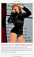
- Wine red= title, date, call-to-action ("Read full article")
- Grey= short copy
The imagery used on the news webpage itself must portray the same brand identity of the artist but can vary in shot distance, angle or colour to make each image unique. For example, the focal image in the middle article is a MLS while the other two are MCUs and this makes it more interesting as her full costume can be seen in the wider shot while the focus is on her face, eyes and hand position in the closer shots. Although the main focal image is the same for the MCUs, editing has differentiated them through their different...
- Backgrounds (L- colourful background, R- black background)
- Filters (L-sepia toned, R- black & white)
- Aspect ratio (L- square, R- landscape rectangle).
CONVENTIONS: While homepages often feature a range of conventions, including social media links and buttons to YouTube, an artists' newspage will conventionally be filled with news articles, regularly updating their fans about the artist's appearances, competitions or announcements.
 Using the example on the right, a news article will conventionally feature a focal image (often relating to the story), the date on which the article was published (either in the format 'Sep 27, 2018' or '2 days ago'), a short title (e.g. 'Vote for the 2018 Music Awards'), a short copy (all of which will be revealed in the full article) and a link to the full article (either with a 'read more' button or with a hyperlink in the copy or linked image).
Once you click on the image or link, a short page comes up with the same focal image in a larger form, taking up half of the screen, with the same title, date and extended copy as well as interactive features such as the social media links, shown below.
In order to make my news page conventional, I plan to incorporate all of these elements and more into my news page.
LAYOUT: From my research, I have found that most artists' news pages have very similar layouts that are made reasonably simple to allow for a wide variety of news articles to be published regularly, which would keep their audience updated on events regarding the artist. For example, Taylor Swift's news page has each news article in a rectangular box, with the date placed at the top followed by the focal image, title, copy and 'read full article' at the bottom.
I intend to experiment with the placement of the different elements within the rectangles but, as Swift's news page has done, plan to keep the layout consistent across the articles to make the page look sleek and organised.
Planning & Pre-Production
Drawings for news page= I sketched out my plans for my news webpage before starting production to ensure I had ideas that I could experiment with once I got onto Wix. For my second webpage, I chose a simple, repeatable layout with lots of space for an image, caption and date in each rectangle, for each news article. I also drew the menu bar (top) and email subscription (bottom) in my sketch as they would be the same as my homepage to maintain the website's overall connectivity.
Plans for News Articles= After drawing out the layout, I planned the articles that I wanted to write about on the news page. This was important as it makes it so much easier for me to decide what images I need to take and what articles I need to write and gives me time to think about the logistics and specifics of elements such as the competition and tour to make my website look like a real dance artist's.
My Planned Fonts= Before creating my website, I also planned the fonts I would use to create a unique brand for my artist. I chose the following fonts after browsing on dafont.com.
I chose 'Blackout Sunrise' as it is a unique font in bubble writing that would stand out on my homepage or single cover and is recognisable to the FRNKE brand. It is also just a capitalised font and therefore works very well with my artist's name.
In comparison, I plan to use my serif font 'Avenir Light' on news articles or longer paragraphs that I may write on my website.


No comments:
Post a Comment